Brief-Driven Design to Code: What We Learned Running 4 Screens Through a VLM Pipeline
I’ve been watching the “screenshot to code” space for a while now. Upload a design, get HTML back. The demos are impressive. The results, in practice, are not.
The problem isn’t the VLM — it’s the prompt. When you hand a vision model an image and say “make this,” you get plausible-looking HTML that falls apart on inspection. Wrong layout model (flexbox where grid is needed), invented color values, no responsive behavior, and a structural understanding that’s about as deep as a puddle. The model is guessing, because you didn’t tell it what it was looking at.
We ran an experiment: what if you told the model exactly what it was looking at — the archetype, the layout model, the design tokens, the component inventory — before asking it to write code? And what if you built the page in layers instead of all at once?
The method
The pipeline has two phases. First, a classification pass produces a design brief — a structured architectural document that tells the VLM what kind of interface this is, what CSS approach to use, what the color tokens are, what each section contains, and how it should respond at different viewports.
Then the VLM builds the page in four layers:
- Layer 0: Canvas — background, ambient effects, grid skeleton with empty placeholders
- Layer 1: Shell — header, navigation, sidebar, structural chrome
- Layer 2: Content — cards, tables, text blocks, interactive elements
- Layer 3: Footer and polish — bottom bars, refinements, final touches
Each layer gets the brief, the design target image, and a screenshot of the current implementation. The VLM sees what it’s built so far, compares it to the target, and adds the next layer.
We tested this on four screens spanning three different archetypes and three different visual languages.
Screen 1: CredentialVault Landing Page
Archetype: Narrative Scroller (marketing page) Aesthetic: Dark corporate
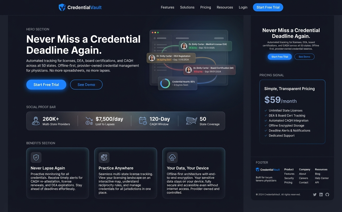
A straightforward marketing page: nav bar, hero section with headline and dashboard illustration, social proof stats bar, three benefit cards, and a multi-column footer. Body scrolls naturally. Classic vertical conversion funnel.
The brief classified this as a Narrative Scroller — body scrolls, flex column layout, max-width constrained, distinct horizontal sections. Tokens were dark blue-blacks (#0d1117 primary surface) with blue accent (#2563eb) for CTAs.
Result: Three VLM calls produced a complete, responsive page with every section present. Nav with shield logo and links. Hero with headline and dashboard mockup placeholder. Stats bar (260K+ providers, $7,500/day, 120-Day CAQH Window). Three benefit cards. Four-column footer. The model even correctly ignored the pricing panel on the right edge of the target (a design annotation, not page content) because the brief said to.
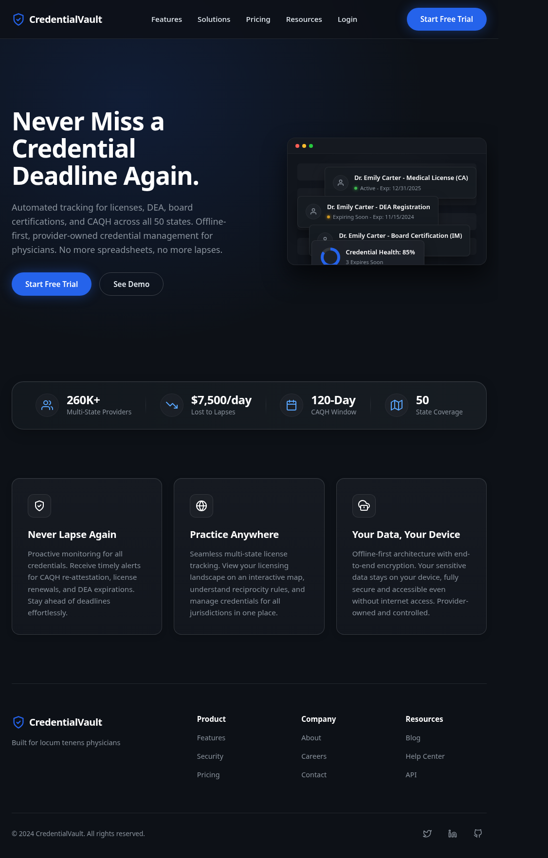
Fidelity: ~95% of elements present and correctly placed.
Screen 2: Decision Forge Comparator
Archetype: Stateful App Shell Aesthetic: Sci-Fi HUD (cold cyan on black)
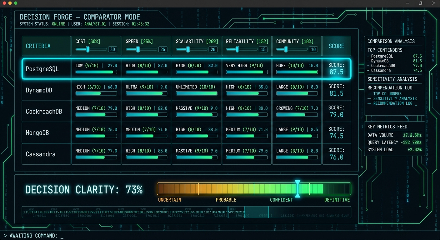
This was the stress test. A viewport-locked data-dense dashboard comparing five database options across five weighted criteria. Horizontal score bars, large cyan score numbers, sidebar analysis panels, a decision clarity gradient meter, a binary ticker, and a terminal-style command prompt. The kind of interface most people would say “the model can’t do that.”
The brief classified it as a Stateful App Shell — viewport locked (100dvh, overflow: hidden), CSS Grid with named areas, monospace typography, angular HUD aesthetic. Tokens were deep dark blue-black (#0a0f14) with cyan accent (#00e5ff) and green score gradients.
Result: Four VLM calls. All five database rows with rating badges (LOW/MEDIUM/HIGH/ULTRA), score fractions, progress bars, and large cyan score numbers. Right sidebar with four panels populated (Comparison Analysis, Sensitivity Analysis, Recommendation Log, Key Metrics Feed). Decision Clarity meter at 73% with the correct red-to-green gradient. Binary ticker scrolling. “AWAITING COMMAND:” prompt with cursor.
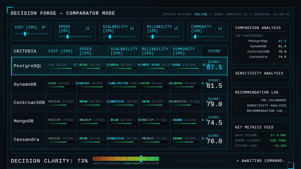
Fidelity: ~90% of elements present. The data table is complete and readable.
Screen 3: Brand Studio Mood Exploration
Archetype: Stateful App Shell Aesthetic: Dark glassmorphism (purple variant)
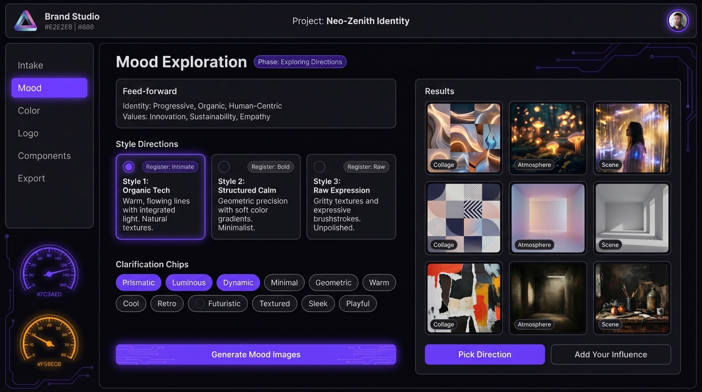
The hardest screen — and the one that exposed the method’s limits. Five distinct grid zones: header bar, left sidebar nav, decorative gauge column, center content panel (with feed-forward context, three style direction cards with radio toggles, clarification chip tags, and three CTAs), and a right results panel with a 3x3 image grid.
Result: Four VLM calls. The center content panel and results grid came out well — feed-forward panel with correct text, style direction cards with radio toggles and “Register: Intimate/Bold/Raw” labels, results grid with gradient placeholders and category labels.
But the sidebar navigation and the decorative gauge dials — the two leftmost columns — were dropped entirely. The 13 clarification chips (Prismatic, Luminous, Dynamic, etc.) and the “Generate Mood Images” CTA also disappeared. The VLM prioritized content over chrome and ran out of budget.
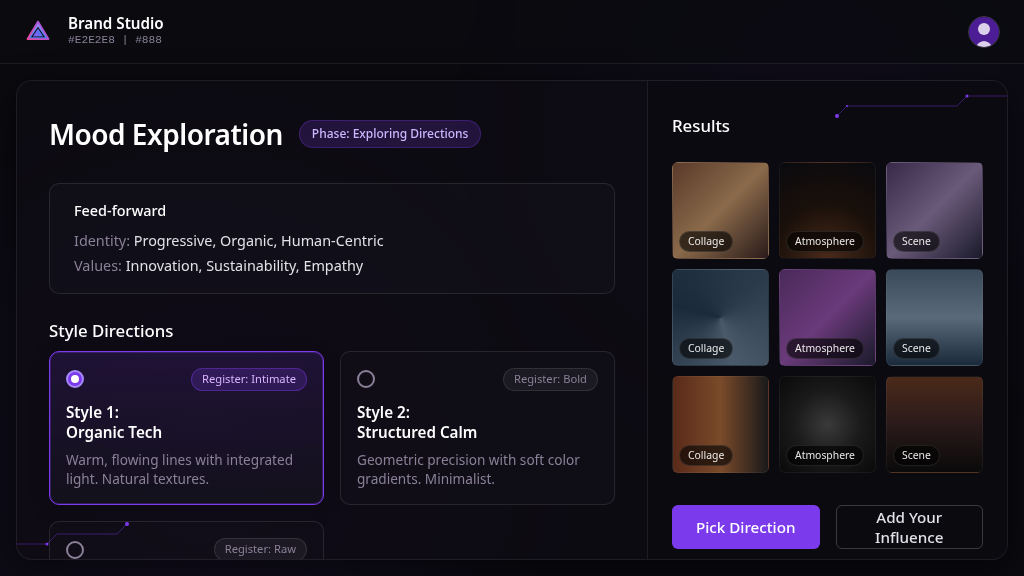
Fidelity: ~65% of elements present. Content correct, but two structural zones missing.
What the brief actually buys you
Without the brief, the VLM guesses at everything: layout model, color values, responsive strategy, component structure. With the brief, it gets all of that for free and spends its capacity on the actual rendering.
Specific things the brief consistently delivered:
-
Correct layout model. The VLM used CSS Grid with named areas for the app shells and flex column for the marketing page. Zero screens had the wrong outer layout. This is the single biggest improvement over blind screenshot-to-code.
-
Accurate design tokens. Colors, border radii, spacing values, and typography choices came directly from the brief’s token block. No more invented hex values.
-
Responsive structure. All four screens included @media queries for 768px and 480px breakpoints. The brief’s responsive strategy section told the VLM exactly what should happen at each breakpoint — sidebar hides, cards stack, stats bar wraps.
-
Correct text content. Every heading, label, badge, and placeholder string from the brief appeared in the output. The VLM didn’t have to read text from the image — it was handed the content inventory.
What broke
The clearest failure pattern: the VLM drops decorative and navigational elements when the screen has more than four grid zones.
Screen 4 (Mood Exploration) had five zones: header, sidebar, gauges, center, results. The sidebar and gauges — the two leftmost zones, both non-content — were the first things cut. The VLM optimized for content density over aesthetic completeness.
This suggests a zone count ceiling of about four for reliable single-pass generation. Beyond that, you need either more granular layers or independent panel generation with composition.
Other consistent weaknesses:
- Third instances of repeating elements get compressed (2 of 3 cards render well, the 3rd is partial)
- Image placeholders are uniform — the VLM doesn’t vary them to suggest different content types
- Elements dropped in early layers never come back, even when later layers could add them
The numbers
| Screen | Archetype | VLM Calls | Elements Present | Layout Correct | Tokens Correct |
|---|---|---|---|---|---|
| CredentialVault | Narrative Scroller | 3 | ~95% | Yes | Yes |
| Decision Forge | App Shell (HUD) | 4 | ~90% | Yes | Yes |
| Mood Exploration | App Shell (Glass) | 4 | ~65% | Partial | Yes |
Design tokens were correct across all screens. Layout was correct when the zone count stayed at four or below. Content fidelity was highest on the simplest layout (CredentialVault) and lowest on the most complex (Mood Exploration).
What we’re building next
The brief is the right abstraction layer. What changes is how the VLM consumes it.
Right now, the brief is a markdown document and the VLM returns raw HTML. The HTML works but it’s 35-50K characters of coupled markup and styling. We’re moving toward a JSON intermediate representation where the VLM describes the screen using a typed component vocabulary (~20 component types that actually appeared across these four screens), and a deterministic renderer maps that to HTML.
The VLM reads a ~200-line brief and writes a ~50-line JSON spec. The renderer produces ~500 lines of HTML. The refinement loop operates on the small JSON, not the large HTML. That’s the theory — we’ll validate it by running the same four screens through the JSON IR pipeline and comparing.
The other change: archetype-specific layer definitions. A marketing page doesn’t layer the same way as a data-dense dashboard. The Narrative Scroller pattern (canvas → header → body sections → footer) worked perfectly for CredentialVault but the generic layer split failed on Mood Exploration. Complex app shells need a “structural chrome” layer before content, and decorative elements need to be treated as first-class citizens in the layer plan, not optional garnish.
The deeper question
Can you go from a design target to production code without a human in the loop? Not yet. But you can get remarkably close if you tell the model what it’s looking at before asking it to build. The brief is the bridge between “here’s a picture” and “here’s what this picture means architecturally.” Without that bridge, the VLM is doing visual mimicry. With it, the VLM is doing informed construction.
The gap between those two things is the difference between a demo and a tool.
This experiment is part of our ongoing work on AI-assisted design systems at GrayBeam. The brief-driven pipeline, component registry, and analysis report are open for discussion — reach out if you’re working on similar problems.