Stop Eyeballing It: A Visual TDD Pipeline for Design-to-Code
I asked three AI models to look at the same design target and write HTML that matches it. Then I measured the results with computer vision instead of trusting anyone’s eyes — including my own.
The experiment revealed something I should have known: the model with exact pixel measurements from a manifest outperformed the models working from observation alone. But the margin was smaller than I expected, and the pattern of where each approach fails taught me more than the scoreboard.
The problem with “looks good to me”
Design-to-code translation is one of those problems that feels solved but isn’t. A designer hands you a mockup. You build it. You put the mockup and the browser side by side and squint. “Close enough.” Ship it.
Except it’s never close enough. The padding is 12px instead of 16px. The background is #1a1a2e in the mockup but #18181b in your CSS because you eyeballed it. The action bar is 8px too high. The settlement indicators are the wrong shade of violet. None of these matter individually. Together, they’re the difference between a UI that feels crafted and one that feels approximate.
Humans are terrible at pixel-level comparison. We’re built for gestalt — we see the forest, not the trees. An AI model looking at a design target has the same problem: it can describe what it sees (“a dark card with three images and a violet button”), but it can’t tell you that the card is exactly 1234x183 pixels, positioned at coordinates (71, 102), with a background of #1A1817 and a 1px border in #F59E0B.
So we built a tool that can.
design_slice.py: the deterministic eye
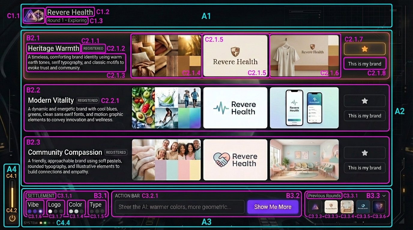
design_slice.py is a CV pipeline that takes a human-annotated component map — a design target with bright bounding boxes drawn around every element — and extracts mathematical ground truth. Bounding boxes, pixel dimensions, dominant colors via K-Means clustering, hierarchy levels, gradients.
The workflow has two modes:
Slice mode takes a component map and the clean design target. It detects the colored bounding boxes via contour detection, maps each box to the corresponding region of the clean target, and extracts a manifest:
{
  "label": "B1.9",
  "bounds": { "x": 372, "y": 639, "w": 632, "h": 84 },
  "dominant_colors": ["#6E37E8", "#31294C", "#181A1F"],
  "contrast_color": "#E8E8E9",
  "level": 1
}
Compare mode takes that manifest and an implementation screenshot, crops the same regions from both, and produces a structured diff report. For each region: mean pixel difference, specific color mismatches with distance measurements.
No subjective judgment. No “looks close.” The math either matches or it doesn’t.
The experiment: three models, one target, zero templates
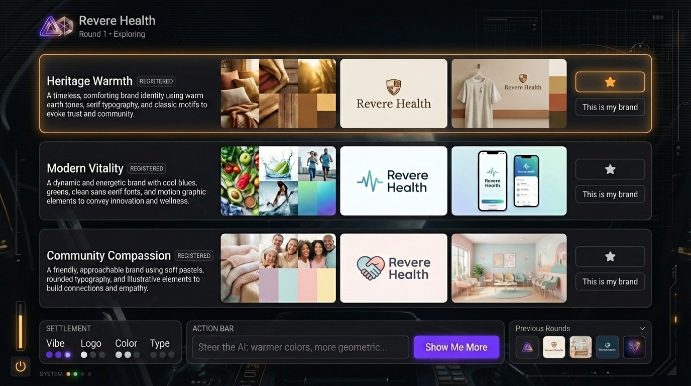
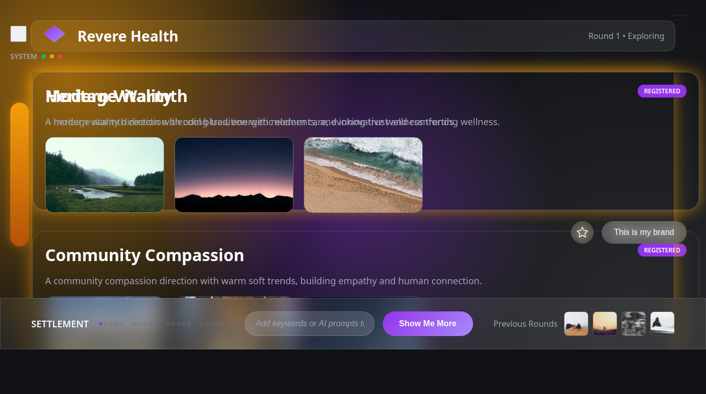
The design target is Brand Studio’s Explore page — a dark-mode creative workspace where users review AI-generated brand concepts across three directions. It has a layered composition: ambient HUD elements at the edges, a minimal header, three direction rows with triptych images, an action bar with a violet button, and settlement indicators at the bottom.
The manifest extracted 25 regions at three hierarchy levels. After marking 8 regions as “ignore” (placeholder images that will always differ), we had 17 testable structural regions.
The contestants
Contestant A: Claude Opus 4.6 (claude-opus-4-6, Anthropic) — Skill-based approach
Gets the full manifest — every region’s exact bounds, dimensions, and hex colors. Also gets the structured breakdown document with layer-by-layer implementation notes. It knows that region B1.9 is 632x84 pixels at position (372, 639) with dominant color #6E37E8. It doesn’t need to observe anything; it has the measurements. Runs as a Claude Code subagent following our /design-decompose skill methodology.
Contestant B: Gemini 3 Pro Preview (google/gemini-3-pro-preview, Google) — Visual observation
Gets only the design target image and a structured prompt (the “Master UI Generation Prompt”) that teaches the Z-Index Method — analyze the image layer by layer from background canvas to foreground content, then implement strictly in that order. No manifest data. It has to look at the image and infer dimensions, colors, and positions. This is the same model we use for image generation in Brand Studio — it’s genuinely multimodal.
Contestant C: Grok 4.1 Fast (x-ai/grok-4.1-fast, xAI) — Visual observation
Same prompt and image as Gemini. Different model, different visual perception.
(We originally planned GPT-5.2 as the third contestant, but it refused both attempts — response blocked with no finish reason. Grok stepped in as the replacement. The AI model landscape in February 2026: one model won’t look at your screenshot, another hallucinates amber onto gray, and the third actually measures before it builds.)
All three produce a single self-contained HTML file. Same design target. Same viewport (1376x768). Same CI diff pipeline judges them.
The results
Each file gets a headless Chromium screenshot at the exact target dimensions, then design_slice.py compare runs the manifest against the screenshot. Here’s the scorecard:
| Metric | Claude Opus 4.6 (Manifest) | Gemini 3 Pro (Observation) | Grok 4.1 Fast (Observation) |
|---|---|---|---|
| MATCH (diff < 20, 0 color errors) | 3 | 2 | 1 |
| DIFF | 14 | 15 | 16 |
| Avg pixel diff (DIFF regions) | 33.0 | 38.3 | 47.6 |
| Total color mismatches | 21 | 19 | 31 |
Claude wins the headline: most matches, lowest average diff. But the per-region story is more nuanced.
Where manifest data dominates
The biggest gaps are in positioning accuracy:
- Action bar (B1.9): Claude 27.5 vs Gemini 86.7. The manifest says this bar lives at coordinates (372, 639) with exact dimensions. Claude placed it precisely. Gemini put it in roughly the right area but missed the position by enough to triple the diff.
- Previous rounds section (B1.8): Claude 8.2 MATCH vs Gemini 40.3 DIFF. Same story — exact bounds from the manifest nailed the layout.
- Top-right HUD lines (B1.1): Claude 6.6 MATCH vs Grok 33.0 DIFF. Peripheral decorative elements are the hardest to place by observation because there’s no semantic anchor — they’re just atmospheric lines near the edge.
This makes intuitive sense. When you tell a model “put a 632x84 element at position (372, 639),” it does exactly that. When you show a model an image and say “replicate this,” it has to estimate every coordinate. Estimation error compounds across regions.
Where observation holds its own
Gemini slightly outperformed Claude on the settlement indicators — the small dot-and-label elements at the bottom:
- B1.11 (vibe dot): Gemini 36.5 vs Claude 38.0
- B1.12 (logo dot): Gemini 32.7 vs Claude 33.9
- B1.13 (settlement section): Gemini 36.4 vs Claude 37.3
- B1.14 (color dot): Gemini 25.8 vs Claude 27.5
These are small, complex regions where the manifest’s K-Means color extraction hits the “volume trap” — the dominant color in a 120x42 pixel region is overwhelmingly the dark background, drowning out the small violet or amber dot that’s the actual visual content. The observational model could see that the dot is violet and style it accordingly, while the manifest-driven model used the dominant color (dark background) and missed the accent.
This is a known limitation of K-Means clustering. A 10-pixel accent dot occupying 2% of a region’s pixels gets dominated by the 98% background. We’ve added a contrast_color field to address this, but the fix wasn’t fully integrated for this experiment.
Where everything fails
Four regions scored identically across all three contestants — B1.15, B1.16, B1.17, B1.18. These are the extreme bottom-edge elements: thin decorative strips and the power icon. All three implementations render them as essentially flat dark rectangles, which is close but misses the subtle warm tints (#22242A vs implementation #0F1114) that give the original its depth.
The lesson: ambient atmospheric elements — the ones that make a design feel rich rather than functional — are the last thing any approach gets right. They’re low-contrast, small, and semantically ambiguous. Neither manifest data nor visual observation captures the intent behind a warm-tinted near-black strip at the bottom of the screen.
What the screenshots look like
Here’s what each model produced from cold:
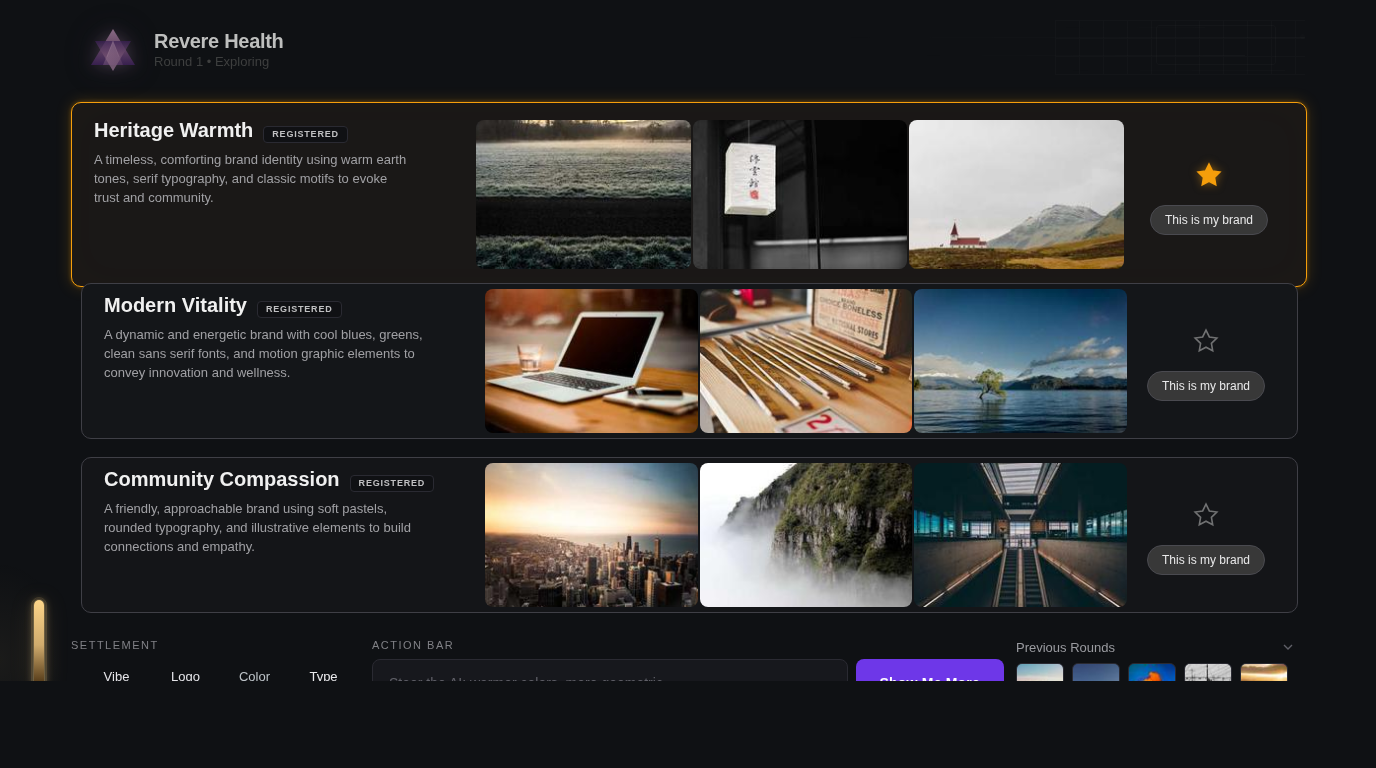
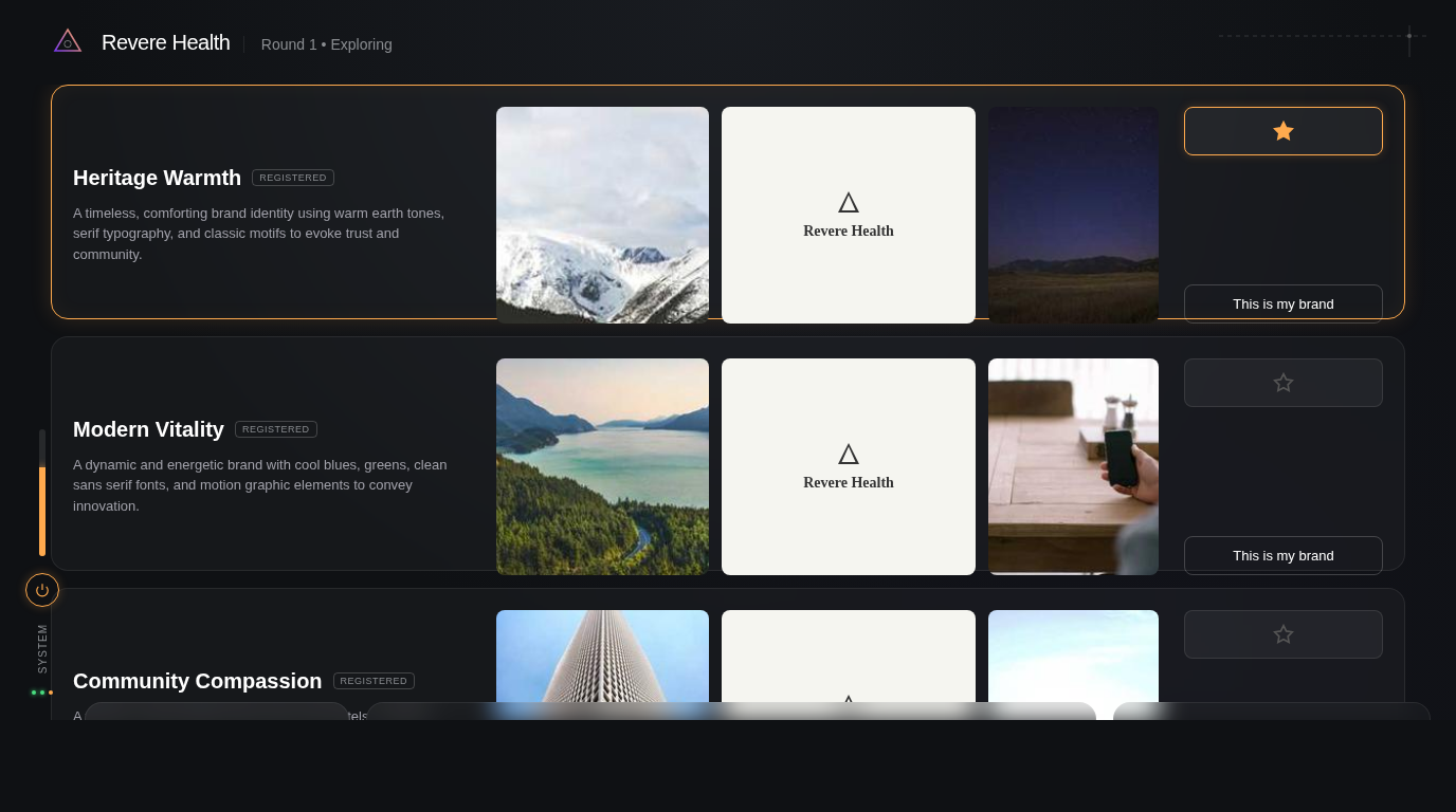
The structural differences are subtle in full-page view. The CI diff catches what your eyes don’t: Gemini’s action bar is in the wrong position. Grok’s header region bleeds amber where it should be neutral gray — it hallucinated the brand’s warm palette onto a structural element. Claude’s settlement dots are slightly too dark because the manifest’s dominant color is background, not accent.
None of these are visible at a glance. All of them matter for production fidelity.
The real lesson: measurement creates a feedback loop
The scoreboard is interesting, but it’s not the point. The point is that design_slice.py compare produces a machine-readable fix list:
{
  "label": "B1.9",
  "status": "DIFF",
  "mean_pixel_diff": 27.5,
  "color_mismatches": [{
    "target": "#31294C",
    "closest_impl": "#56565E",
    "distance": 61.0
  }]
}
That’s not a vague “the action bar looks off.” It’s: “region B1.9 has a color at #56565E that should be #31294C, with a Euclidean distance of 61 in RGB space.” The fix is a one-line CSS change. No guessing.
This is Visual TDD — the same red-green-refactor loop from software testing, applied to pixels:
- Red: Run
design_slice.py compare. Read the DIFF regions. - Green: Fix the specific CSS property the report identifies.
- Refactor: Re-screenshot, re-compare, confirm the region now reports MATCH.
- Repeat.
Each cycle is deterministic. You never wonder “did I fix it?” You read the report. The math tells you.
In our dashboard prototype (a different screen, same pipeline), we went from 2 MATCH to 7 MATCH out of 56 regions in three fix cycles. The remaining DIFFs were either placeholder content (expected) or sub-pixel rendering differences below the perceptual threshold. Every structural element converged.
The pipeline
For anyone who wants to build something similar, here’s the full flow:
- Design target — Generate or receive a pixel-perfect mockup at your target viewport dimensions.
- Component map — Annotate the target with colored bounding boxes around every element. We use Gemini’s image generation to produce these overlays, but you could draw them in Figma.
- Slice — Run
design_slice.py slice <cmap> <target>to extract the manifest. This is your ground truth. - Implement — Write the HTML/CSS/JS. Use manifest values for all dimensions and colors. Never eyeball.
- Compare — Take a headless screenshot at the exact target viewport. Run
design_slice.py compare <manifest> <screenshot>. - Fix — Read the report. Fix the DIFFs. Re-compare.
- Ship — When structural regions all report MATCH, you’re done.
Steps 4-6 repeat as many times as needed. The key insight is that step 5 is free — it runs in milliseconds and gives you exact, actionable feedback. Compare that to the traditional workflow of squinting at two browser tabs and hoping you noticed the 4px padding discrepancy.
What this means for AI-generated UIs
The experiment confirms something practitioners have suspected: AI models can see a design, but they can’t measure it. Visual observation gets the gestalt right — the overall layout, the color palette, the vibe. But it misses the precise coordinates, the exact hex values, the mathematical relationships between elements.
This suggests a hybrid approach:
- Use a VLM for the creative pass. Feed it the design target, get a first-draft HTML that captures the overall structure and aesthetic. It’ll be in the right ballpark.
- Use CV measurement for the precision pass. Run the VLM output through
design_slice.py compare, get the exact discrepancies, and fix them mechanically.
The VLM does what it’s good at (perception, interpretation, creative translation). The CV pipeline does what it’s good at (measurement, comparison, verification). Neither replaces the other.
We’re encoding this as a workflow in our /design-decompose skill — the structured methodology that runs the full pipeline from design target to verified prototype. The skill ensures the measurement step actually happens, because the natural human (and AI) instinct is to skip it. “Looks good” is easier than “measure it.” But “looks good” ships a UI that’s 4px off in twelve places.
The ambient problem
The one area where neither approach works well is ambient design — the subtle atmospheric elements that make a dark-mode UI feel rich rather than flat. The warm tint in a near-black background strip. The soft amber glow around a starred element. The faint geometric lines in the corner that suggest depth without demanding attention.
These elements are low-contrast by definition. K-Means clustering assigns them to the “dark background” bucket. Visual observation models describe them vaguely (“subtle dark area at the bottom”). Neither approach captures the intent: this strip should feel warm, like instrument lighting in a cockpit.
This is where a human designer’s judgment remains essential — not for the measurable stuff (let the pipeline handle that), but for the ambient layer that gives a design its soul. The manifest can tell you the hex values. It can’t tell you why #22242A feels warmer than #1E1E22 even though they’re four steps apart in RGB space.
That’s a design decision. The pipeline frees you to focus on it by handling everything else.
Brand Studio is being built in public at GrayBeam. The design_slice.py pipeline and /design-decompose skill are part of our open methodology for AI-assisted UI development.